

We often say not to judge a book by its cover but how do we refrain ourselves when it comes to website designs. And in this era of a magnetically attractive website, we come across many that make a disaster. The aesthetics are put in question with websites that are funny, congested, or even worse.
It’s not just the elements that make a website lose its consistency but it can be terrible graphics and even a lack of user-friendly navigation that speak out loud to leave the site. We are now going to talk about the designs that failed in 2020 and we should probably not continue in the year 2021.
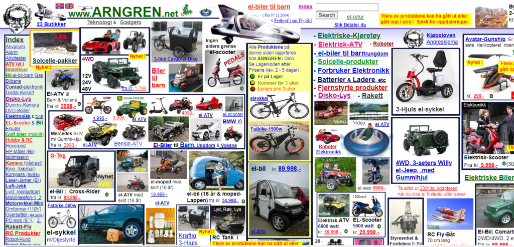
1. Arngren.net
Clients pay special attention to appropriate site structure that encourages them to explore around. Arngren’s site comes up short on all of it. It’s everywhere on the website, the lack of graphic knowledge and poorly planned color tones. The helpless framework and navigational design have left the page overbearing for anyone to look over for once and want to explore.
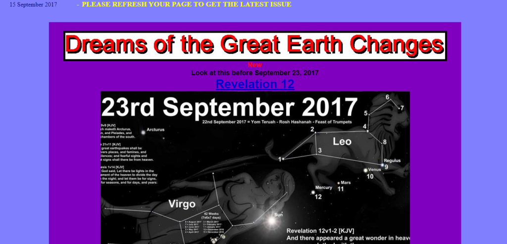
2. Great Dreams
The confusing website has left us with no space to read the content with tones working so harshly to the eyes. Font size is minuscule and it explains a terrible plan that is hardly readable. Along with this, there are weird pop-up messages and certainly, everything on the website doesn’t let you focus on what is the intent of the page. It’s loud and unclear. It might seem like a great online information inventory, unfortunately, nothing is readable and color tones are too loud to let you stay on the page for long.
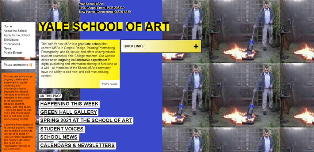
3. Yale School Of Art
What would you expect from a website that belongs to a renowned art school? Appealing, incredible, beautiful, alas! nothing comes to your expectation when you visit Yale School Of Art online and the website seems dull with no life. However, the website is far from what the school practices and leaves you puzzled with the way they have chosen to not frame their beautiful artwork online.
The tile background, which certainly has nothing to do with creativity will seem like an eyesore and nothing engaging. There’s unreadable text on the website as the words are too many and difficult to read with the kind of layout adapted.
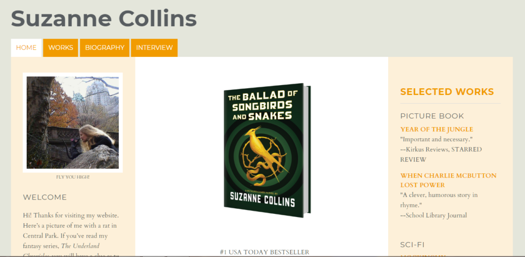
4. Suzanne Collin’s Book Website
There are a number of crazy fans for Suzanne’s work as you speak of Hunger Games. Astonishingly, it’s equally disappointing to see her website. The website content needs super zooming to read the content and as you zoom out the white spaces will show up for no reason.
Where you will expect to find some information or description about the books, you will click on the book icons only to roll back to the same page for awards and reviews. Yes, there are no descriptions of the books. With several links that don’t take you to a relevant page, there are missed opportunities by Suzanne from her audience.
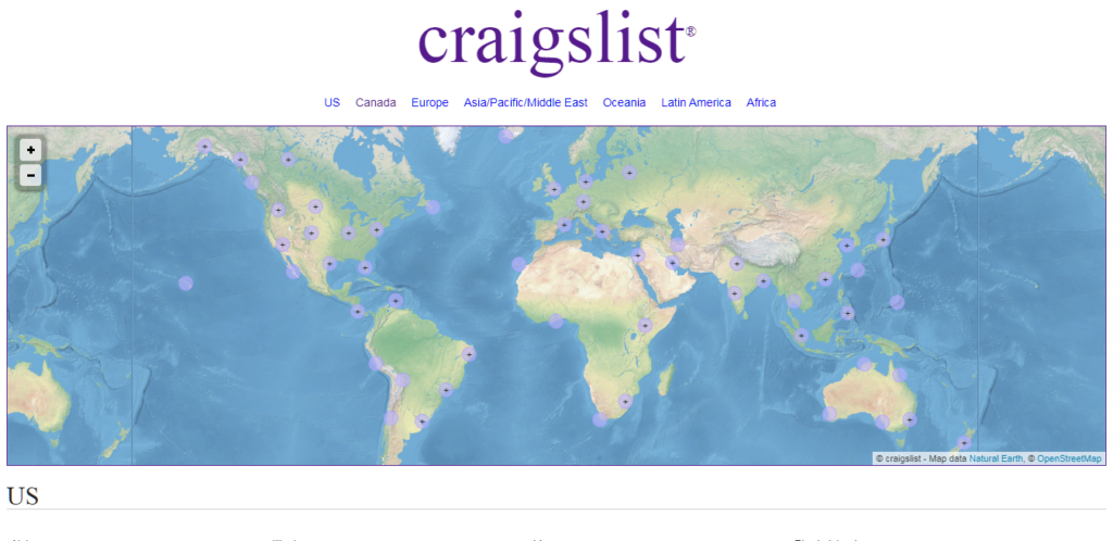
5. Craigslist
You think of classified ads and Craigslist appears to you as one of the top websites to publish them. However, the website is using the same design since 1996 and has all the mishaps that one might take care of when designing to run a good business.
The cluttered design having no visual appeal can leave the audience bore and not wanting to look further. While it doesn’t anything inhibiting the text, the font is so small that it is unreadable. Also, the bright blue color only adds to pain in the eyes when browsing through the ad list. The website needs a good design, which is ignored for a long time now.
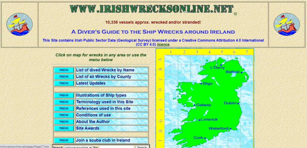
6. Irish Wrecks Online
The online layout of this website gives an assumption that it wasn’t created by a professional but a sailor who was in hurry to put everything together. The poor navigational structure makes it very difficult to even want to explore the website and the text is unreadable too.
How would you be able to see through the information that presents innumerable font styles to you compact in a small space? The bold colors, fonts, and the information, everything combined together make it a big fail as a good website.
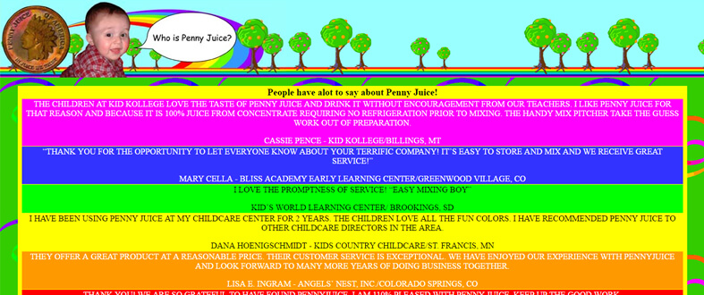
7. Penny Juice
Penny Juice is an awful design among these models – a web page, that has neglected to accomplish any site objectives, such as navigation, visual appeal, or clear description of the product.
The main thing you come across when you land on the site is too many colors flashing on the page. The design is demanding for good navigation: you can’t explore the entire website in an undisturbed manner.
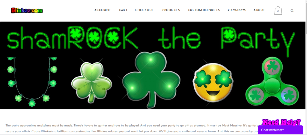
8. Blinkee Website
The website is created to sell glowing things. Unfortunately, you aren’t able to see the products clearly because of the annoying website design. Also, the product images aren’t in focus, rather other elements speak out loud. The products and animation do not allow you to see the real items. Black background and high tone colors cause the real problem to any viewer who would quickly switch away from the website.
Website frames are hollow and unattractive, which draw the attention away and not appeal instead.
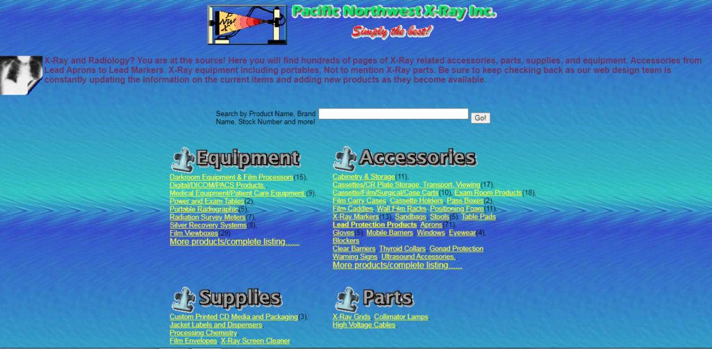
9. Pacific Northwest X-Ray Inc
This site has blended too many colors together that don’t really gel with each other. Nonetheless, the topic of Pacific Northwest X-Ray Inc looks obsolete with a website design that is so bland. It uses a clashing backdrop and text colors that make it hard for clients to take a look at the content. Besides, the design is of a kind that makes navigation really hard for clients. All these elements together are a make an awful website that we can witness in front of us and needs to be worked on.
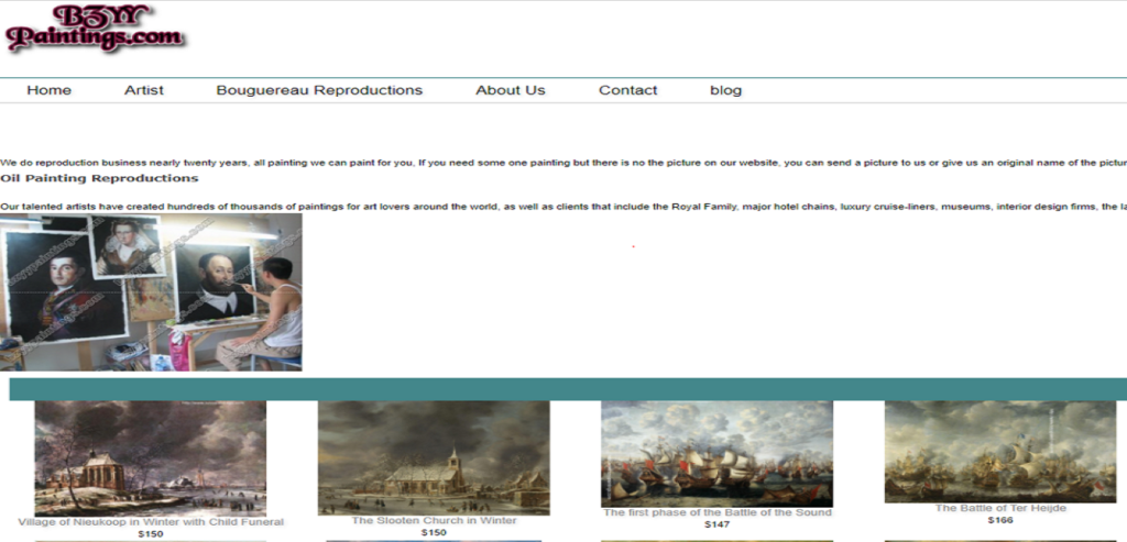
10. Bzyy Paintings
For a site that sells artistic creations, the audience will want to see something that appeals to the eyes right after you log in. However, when you enter the site, there’s much simplicity and no creative lookout. First and foremost, it has a horrendous arrangement structure which makes it difficult to navigate. There’s additionally the situation of poor text addition. Bzyy Paintings site is far away from a creative structure and appeal. It needs attention and a really good design that evokes people to buy from them.
Looking at these websites we know the kind of impact website designs can create. Take these as examples to learn from and create a website that meets your business requirements.
- App Store Optimization
- Artificial Intelligence
- CakePHP
- Competitor Analysis
- Content Marketing
- Custom PHP
- Digital Marketing
- eCommerce
- eCommerce SEO
- Email Strategy
- Facebook Marketing
- Google Adword
- Google Algorithm
- Instagram Marketing
- Jobs
- LinkedIn Marketing
- Magento SEO
- Mobile Apps Development
- News
- Online Reputation Management
- Other
- Pay Per Click
- Pintrest
- Search Engine Optimisation
- Social Media Marketing
- Traditional Marketing
- Uncategorized
- Viral Marketing
- Website Design & Development
- Wix SEO
- WordPress
- WordPress SEO